
 Social Proof
Social Proof Examples for SaaS Websites: 7 Ideas to Build Trust
See seven practical social proof examples for SaaS websites, where each works best, and how to add credible proof without overdoing it.

The best social proof answers a specific doubt with evidence. A visitor wondering whether anyone pays for a new SaaS product needs a different signal from a procurement lead checking whether the product works for companies like theirs.
That is why adding every logo, quote, counter, and popup you can find rarely makes a page more credible. Start with the objection, then choose the smallest proof format that answers it.
Research supports that emphasis on source quality. Northwestern University’s Medill Spiegel Research Center found that identifying verified buyers improved purchase likelihood by 15% in its retail dataset. That does not promise the same lift for every SaaS page, but it does show why the origin of a claim matters—not just the claim itself. See the original review research.
Here are seven useful social proof examples for SaaS websites, with practical advice for using each one honestly.
1. Recent purchases and subscriptions
What it is: A small notification showing that a real customer recently bought a product or began a subscription. The useful version names the event clearly and avoids exposing personal information.
Why it works: New or unfamiliar products can feel inactive. Recent customer activity gives visitors evidence that the business is operating and that other people are making the same decision they are considering.
Where it works best: Homepages, product pages, pricing pages, and campaign landing pages. It is usually unnecessary inside an account area or during checkout.
Realistic example: “Someone in Toronto started a Pro subscription 2 hours ago.” If the provider did not supply a suitable location, the message can simply say, “Someone started a Pro subscription 2 hours ago.”
Implementation advice: Use real events, keep the pace calm, and link the product name to the relevant offer when that helps the visitor. PopupNeko can turn eligible purchases and newly created subscriptions from Stripe, Lemon Squeezy, or Polar into website notifications. It does not treat renewals as new subscriptions or let merchants invent sales.
For a full implementation plan, read How to Add Social Proof to Your Website.
2. Customer reviews
What it is: Feedback submitted on a review platform, marketplace, app store, or your own product. A review usually includes a rating, written comment, reviewer identity, date, and source.
Why it works: Reviews use the customer’s language and can surface benefits or limitations that polished marketing copy misses. Specific comments such as “the export kept our weekly reporting under ten minutes” are more useful than “great app.”
Where it works best: Feature pages, extension landing pages, comparison pages, and the part of a pricing page where a visitor is weighing risk.
Realistic example: A Chrome extension site shows a four- or five-star Chrome Web Store review that mentions a feature discussed on the current page, with a link back to the original review.
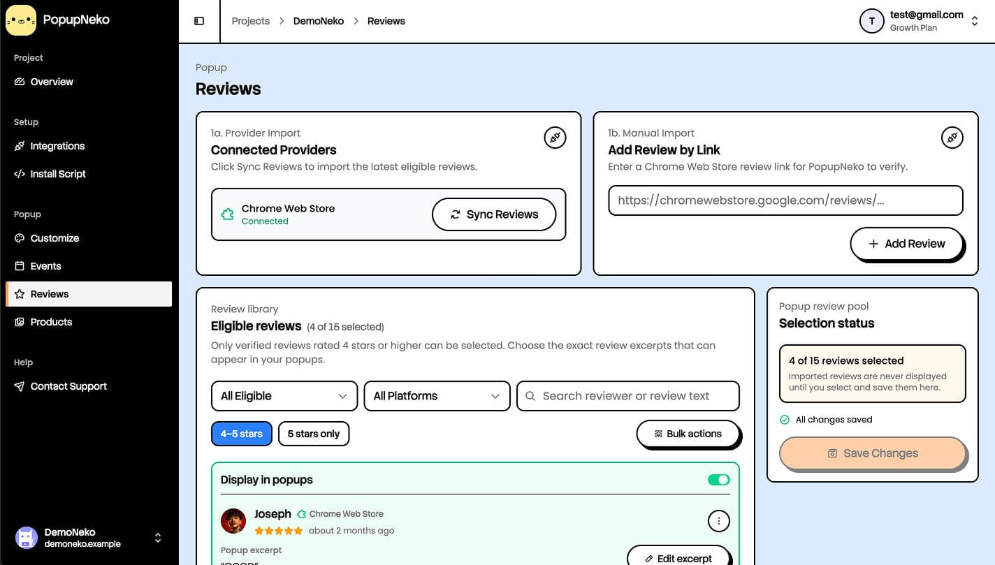
Implementation advice: Preserve the reviewer’s meaning, show the source, and obtain permission when you republish feedback outside the original platform. Do not quietly rewrite a review into a stronger claim. PopupNeko can import eligible Chrome Web Store reviews, let the publisher select faithful excerpts, and link visitors to the original public review. The Chrome Web Store review guide explains the current workflow.
3. Testimonials
What it is: A customer endorsement deliberately featured by the business, usually as a quote with a name, role, company, and optional photo.
Why it works: A good testimonial combines relevance and specificity. “Cut our monthly close from three days to one” gives a prospect something concrete to evaluate; “we love it” does not.
Where it works best: Beside the feature or objection the quote addresses, on pricing pages, and in persona-specific landing pages. A testimonial from a solo founder may be ideal on an indie plan page but less persuasive on an enterprise security page.
Realistic example: “We replaced three spreadsheet handoffs and now every launch request has an owner.” — Priya Shah, Operations Lead at Acme Studio.
Implementation advice: Interview customers soon after a clear success, ask what changed before and after the product, and get approval for the final wording, name, title, logo, and photo. Keep the evidence proportional: do not turn one customer’s result into a universal promise. In the United States, the FTC distinguishes testimonials from ordinary hosted reviews, so treat featured endorsements as advertising claims.
4. Customer or user counts
What it is: An aggregate such as “Used by 10,000+ people,” “2,400 teams created a project,” or “Customers in 32 countries.”
Why it works: A meaningful count can reduce the fear that a product is untested. It is quick to scan and does not require visitors to read several quotes.
Where it works best: Hero sections, signup screens, pricing pages, and app-store landing pages—provided the metric is relevant to the decision.
Realistic example: A browser extension with 12,430 active installations says, “Used by 12,000+ Chrome users,” rounding down rather than implying false precision.
Implementation advice: Define the metric before publishing it. Are these registered accounts, active users, paying customers, or downloads? Remove test accounts and duplicates, pick a conservative threshold, and document when the number was last refreshed. A smaller honest count beats a large ambiguous one.
5. Customer and company logos
What it is: A row or grid of recognizable organizations that use the product, often paired with “Used by teams at…”
Why it works: Logos compress familiarity and audience fit into a visual signal. They are strongest when a visitor recognizes a company similar to their own.
Where it works best: Near the top of a B2B SaaS homepage, on a persona landing page, or beside an enterprise CTA.
Realistic example: A developer tool shows logos from a small agency, an open-source project, and a mid-market software company instead of five unrelated household brands.
Implementation advice: Get permission, follow each company’s brand guidelines, and be precise about the relationship. A company that joined a beta is not automatically a long-term customer. Use consistent visual weight so one logo does not dominate, and add accessible alt text or an accompanying text list.
6. Case studies and customer results
What it is: A structured account of a customer’s situation, the product they used, the work they changed, and the result they observed.
Why it works: A case study shows causality and context better than a one-line quote. It helps a serious buyer decide whether the same approach could work in their environment.
Where it works best: High-consideration SaaS, sales-assisted funnels, integration pages, and feature pages that solve an expensive or complex problem.
Realistic example: “How a five-person extension team cut review triage from two hours a week to twenty minutes,” with the original workflow, setup steps, time period, and measurement method.
Implementation advice: Include the baseline, timeframe, customer constraints, and what else changed during the period. Use exact numbers only when the customer can verify them. If confidentiality limits detail, explain the methodology instead of inventing precision. Link a short result near the CTA to the full story for readers who need evidence.
7. Third-party platform activity and reviews
What it is: Customer activity that originates on a system outside your marketing site—such as a payment provider, marketplace, or public review platform—and is brought into the buying journey with its source intact.
Why it works: Visitors do not have to rely entirely on a claim written by the company. Nielsen Norman Group’s usability research found that people often look beyond company-controlled pages and compare them with ratings and reviews from third parties.
Where it works best: New products, indie SaaS, Chrome extensions, and small online businesses that have meaningful activity on another platform but limited brand recognition on their own domain.
Realistic example: A pricing page cycles between a recent Polar subscription and a selected Chrome Web Store review. The payment activity shows momentum; the review explains why a customer values the product.
Implementation advice: Keep the platform name visible, offer a verification path where possible, and do not imply that a source endorses your company. PopupNeko connects to supported payment and review sources, sanitizes the activity needed for display, and can link the notification to a public verification context. Start with the integrations overview to see the current boundaries.
Which social proof example should you use first?
Match the proof to the largest unanswered question:
- “Does anyone use this?” Use a defensible customer count or recent customer activity.
- “Will it work for someone like me?” Use a relevant testimonial, review, or case study.
- “Can I trust this company?” Use third-party sources, transparent customer details, and clear verification.
- “Can it produce the result I need?” Use a measured case study close to the relevant feature.
One strong signal near the decision point is usually better than a crowded “wall of love.” Review your proof quarterly, remove stale claims, and check that every logo, number, quote, and notification can still be defended.
If verified customer activity fits the objection on your site, start a PopupNeko free trial and connect a supported source. If you need a broader implementation plan first, continue with How to Add Social Proof to Your Website.
